M1 24-inch iMac Review Roundup | 2021
The reviews of the new iMacs have surfaced, and they are not disappointing as seen in countless M1 24-inch iMac review. The first thing reviewers noticed is how beautiful these computers look in person–no surprises there! They also had a chance to test out some of the latest features.
If you’re wondering if either one is worth your investment? Keep reading below so we can tell you everything else you need to know before making any decisions!
In our roundup of the new iMac, we take into account all reviews from experts around the web to provide one comprehensive overview – including what critics say about its features like battery life and whether they recommend buying or not!
Design | M1 24-inch iMac Review Roundup
Pocket-Lint writes that the stand on the iMac is still not adjustable, which led him having to set the iMac on a book.
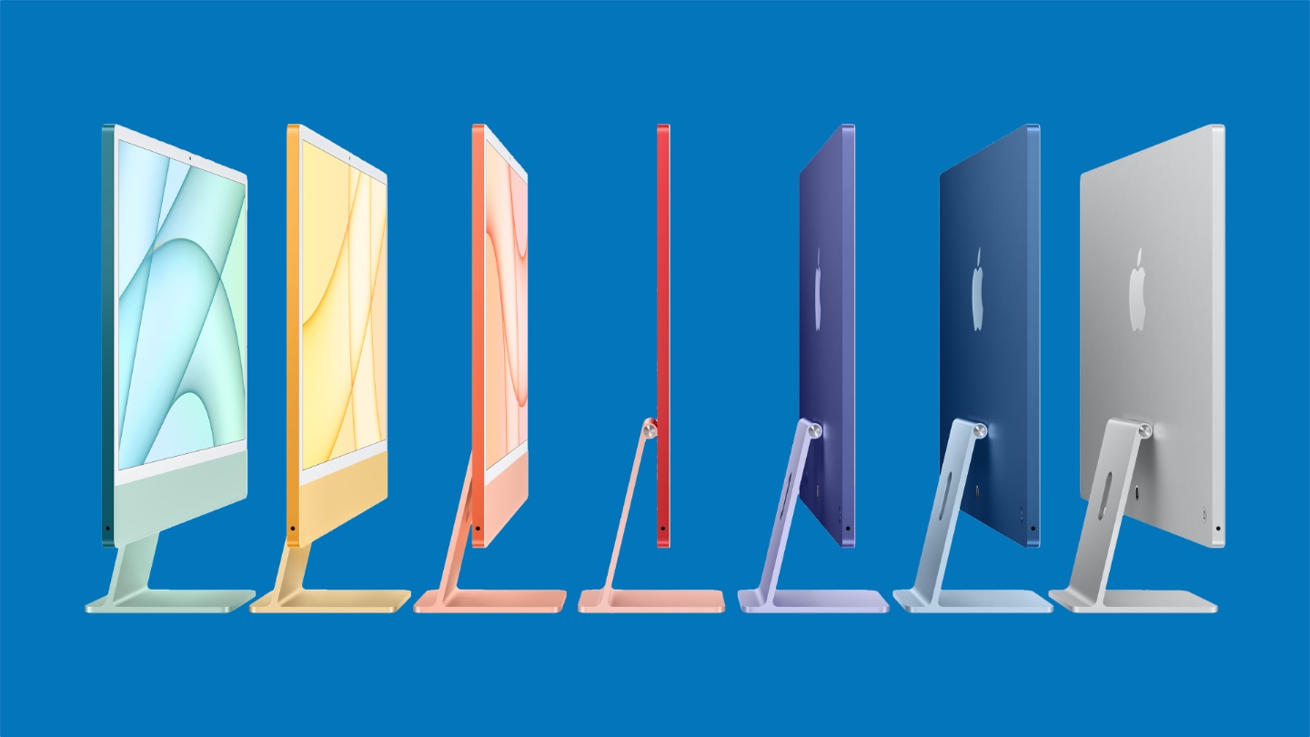
The L-shaped stand from the old iMac remains, but it is lower and it now accommodates a larger Apple logo on the back, reflecting the light so it looks like it illuminates (it actually doesn’t light up, it just fooled us at first).
Notice that the logo has disappeared from the front, which we still think is a little bit of an odd choice, but then there’s no Apple logo in front of you when you’re using a MacBook, iPad or iPhone (yes, we know, there’s one in the top corner on macOS).
The iMac’s stand isn’t height adjustable, which is a downside. We ended up standing our review model on top of a book to raise it up slightly on our desk.
Don’t worry if it’s all too much for your eyes, though, as you can still get the iMac in more standard silver. Or, if you’re feeling more individual, there are a further five hues to choose from (though the basic model only has four options – blue, green, pink, silver – as there are some differences with that model as we’ll discuss below).
Gizmodo describes, “The new iMac is cute, colorful, and compact.”
The colorful design also brings to mind the iconic Bondi Blue of the iMac G3, back when gadgets had warmth and personality. The new iMac’s white bezel, which was polarizing when Apple showed it off at its Spring Loaded event, reminds me of my first iMac, the white polycarbonate Intel version circa 2006. The design manages to be both refreshing and a throwback, and I love it. For the latest iMac, Apple ditched the dated bulbous design of the old 21.5-inch model and slimmed down the overall body to just 11.5mm thick. It’s incredibly lightweight and easy to move or reposition whenever you need to.
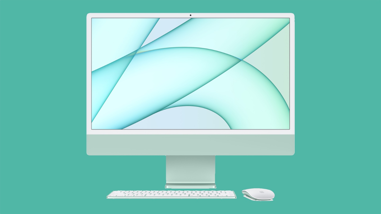
The new iMac is cute, colorful, and compact. It makes more of a statement than your phone does—if you want it to. There’s also silver for those who prefer to play it safe.
Engadget describes the new design, particularly focusing on the orange color option:
I opted for the orange iMac for our review, but Apple should have probably just called it creamsicle. It has a bit of a pinkish hue along the “chin” below the screen, while the rear case looks more distinctly orange. And despite the playful aesthetic, the iMac still looks and feels like a premium device. I particularly like the way light bounces off the back of the sturdy base. The iMac hasn’t had this much Pixar-esque energy since the days of the lampshade G3. Hell, Apple could still benefit from following some design ideas from that long-forgotten machine — or maybe I’m just the only one that misses being able to adjust my screen vertically.
Writing at Six Colors says the color scheme works well.
But when you sit down to work at the iMac, you get a different impression. The bright color is there, visible on the stand. Above that is a more muted version of the accent color on the “chin” beneath the display. The bezels around the display itself are a neutral gray. It’s effectively a gradient, with your peripheral vision noticing the bright color, but that accent fading away until you’re left with whatever is on the display itself. It works really well, though I imagine that if you’re someone who prefers using Dark Mode in brightly lit rooms, it will be a pretty dramatic contrast. (I’m a Light Mode person myself, and I found the overall effect quite harmonious. But then, my office wall is orange.)





0 Comments